Examples of long-form print layouts:
(scroll DOWN for examples of graphic assets designed for social media, email, promotional giveaways, and schedule posters)
Citizens Energy Group 2021 Sustainability Report: HERE
I designed the entirety of the document. The main design goal, in addition to being aesthetically pleasing, was to be easily readable on a web browser, whether it be on computer, phone, or tablet. Additionally it is designed to be easily printable to be effective and accessible for all Citizens customers since the customer base ranges in age, socioeconomic status, and their ability to use technolog
Text was provided by the Citizens communications team. Some photos included were taken by me, other Citizens graphics team members, or purchased stock photos through Getty Images.
Citizens Energy Group Engage Magazine:
This is a 12/16 page magazine for Citizens employees that I design every six weeks with provided content. It is printed and mailed to retirees and to be placed in common workspaces. Additionally it is posted as a PDF on the employee-only website, and then each story is posted as an individual blog post on the public website. I have linked some of the more designed article's blog posts below as examples.
October/November 2021 Cover Story and Accompanying Assets: HERE
This includes the cover, which I designed in Adobe Photoshop, an infographic, which I designed in Adobe Illustrator with icons designed by myself and my fellow graphic designer, and then photographs that I took.
October/November 2021 State of the Trust Page: HERE
This was a page that was formatted specially to share our CEO's vision and plan for the company in 2022.
September 2021 Quarter Century Club Inductees: HERE
Each year Citizens celebrates employees who have worked at the Trust for 25 years. Because of COVID-19, the normal annual event has been cancelled, and we have tried to do a special recognition in the employee magazine. The linked page shows the cover designed to recognize all sixteen employees in 2021, and then the designed pages reformatted for an online blog platform.
ExampLEs of Graphic designs for social media, emails, promotional giveaways, and schedule posters.
Please hover over or click on the image to get more details on the project, design, and design process. Feel free to reach out if you'd like more information or more examples.
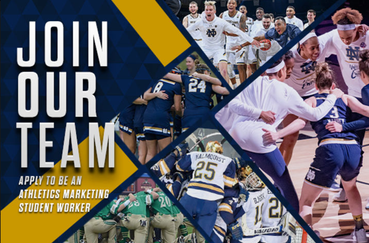
For Notre Dame Athletics: Used to recruit more student employees as an icon in emails and on social media.

For USA Football and the US National Football Team: Social media graphic designed in Photoshop.
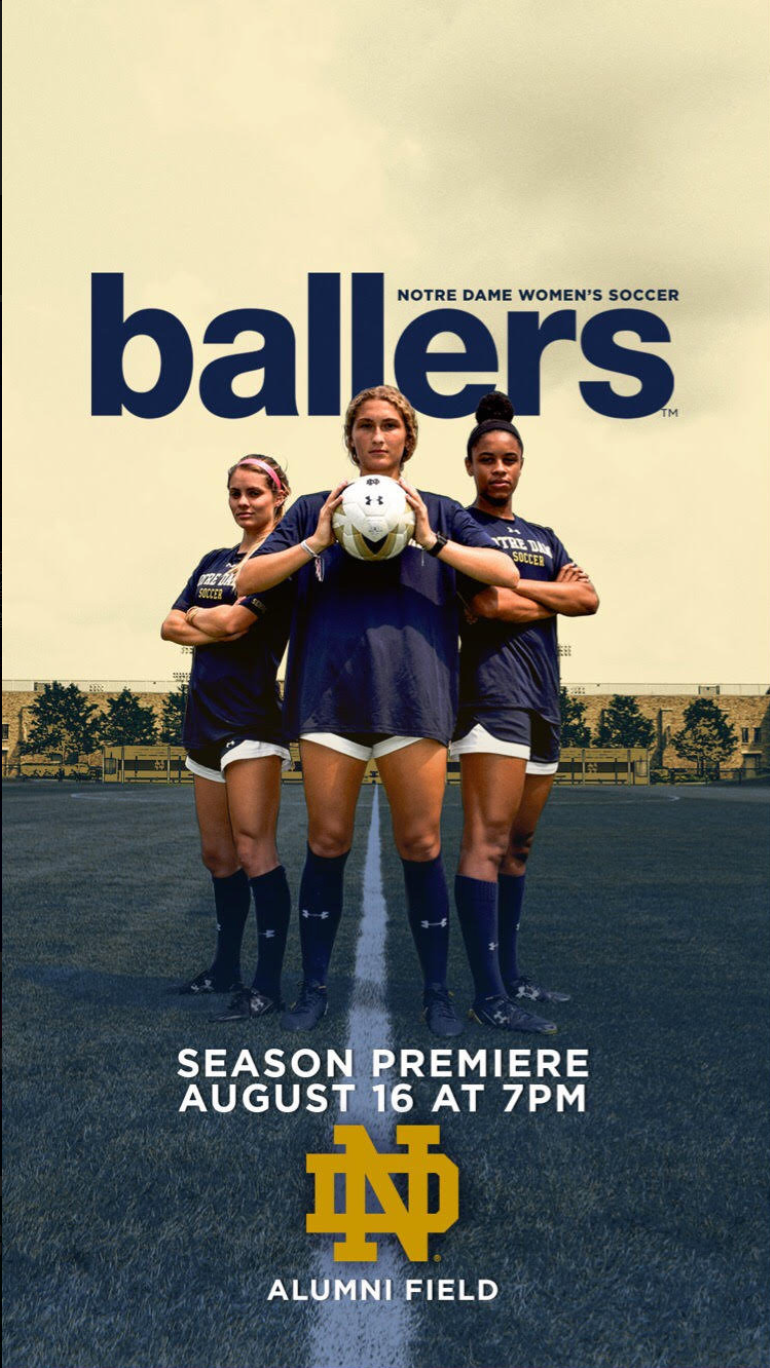
For Notre Dame Athletics. This was a last minute idea to do graphic for the ND Women's Soccer Team game that would be played on the same day as the season premiere for popular HBO show, Ballers. I took the photo and used Photoshop to mimimic the HBO poster. This led to a series of themed social media promo graphics for players to use on their own social media to market the games and invite friends based off of popular TV shows that matched with the theme/game promotion.
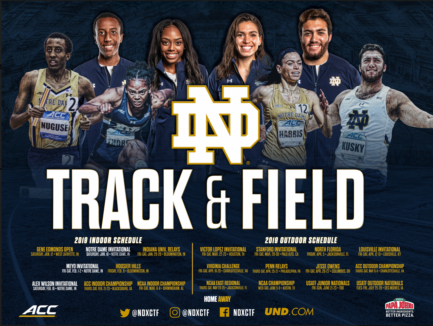
For Notre Dame Athletics: This was the Notre Dame Track and Field schedule poster.
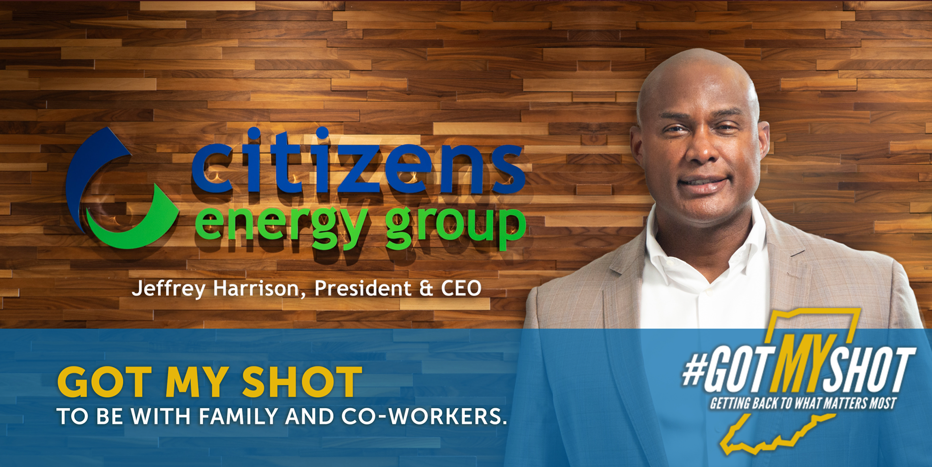
For Citizens Energy Group: This was a graphic I created in Photoshop featuring the Citizens Energy Group President & CEO using assets and elements provided by a partner to use in shared social media promotions.
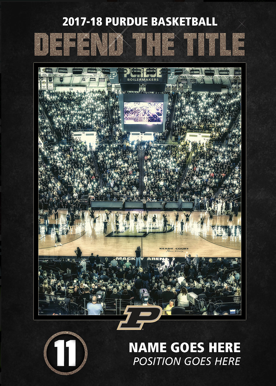
For Purdue Athletics: This was a template that I received and changed for the new season. Again, please note, this was a template redesign, but I did NOT create all the original elements of this.
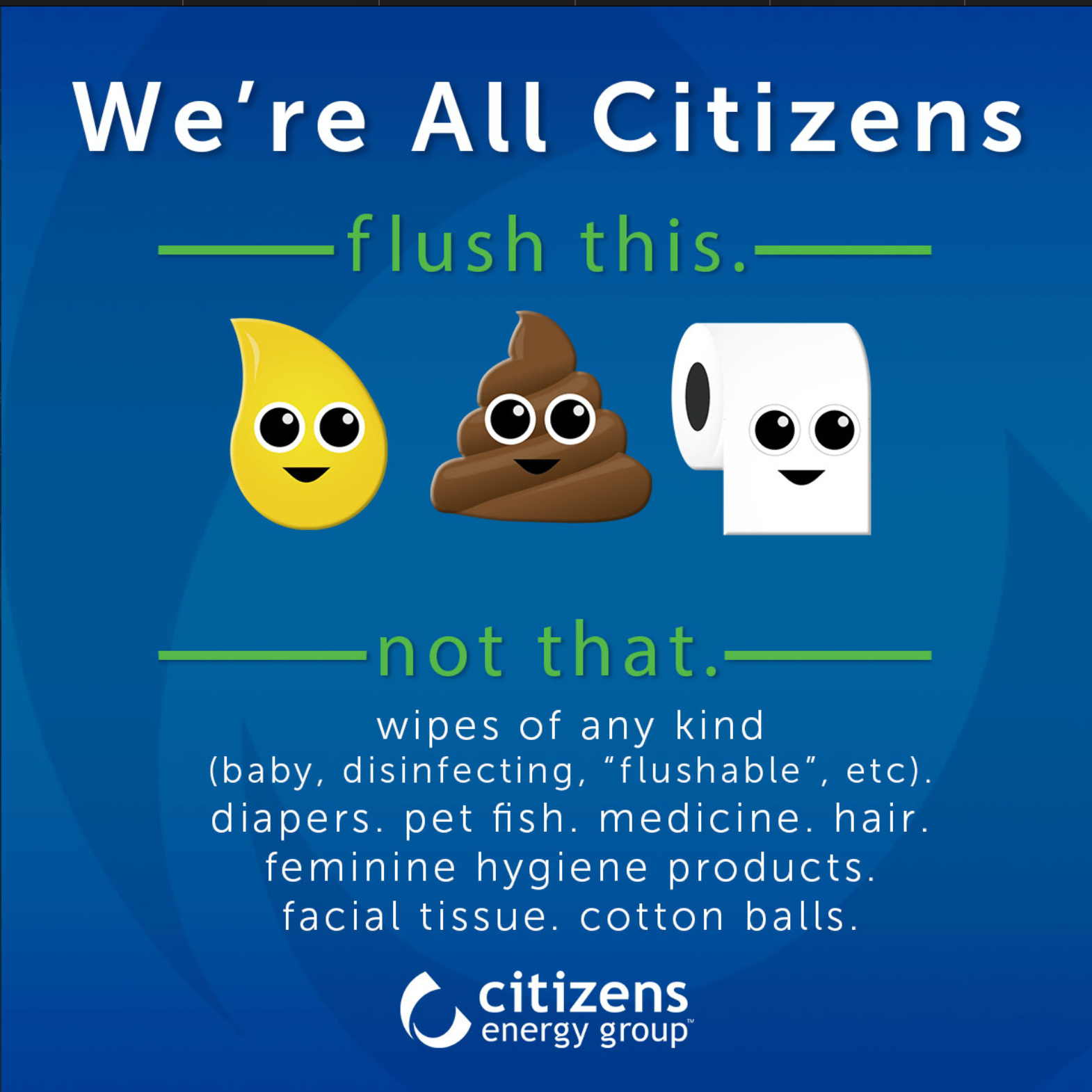
For Citizens Energy Group: This was a social media graphic created in various sizes to remind customers what is safe to flush and what isn't to avoid costly septic repairs. I designed the graphic in entirety, including creating the emojis in Adobe Illustrator.
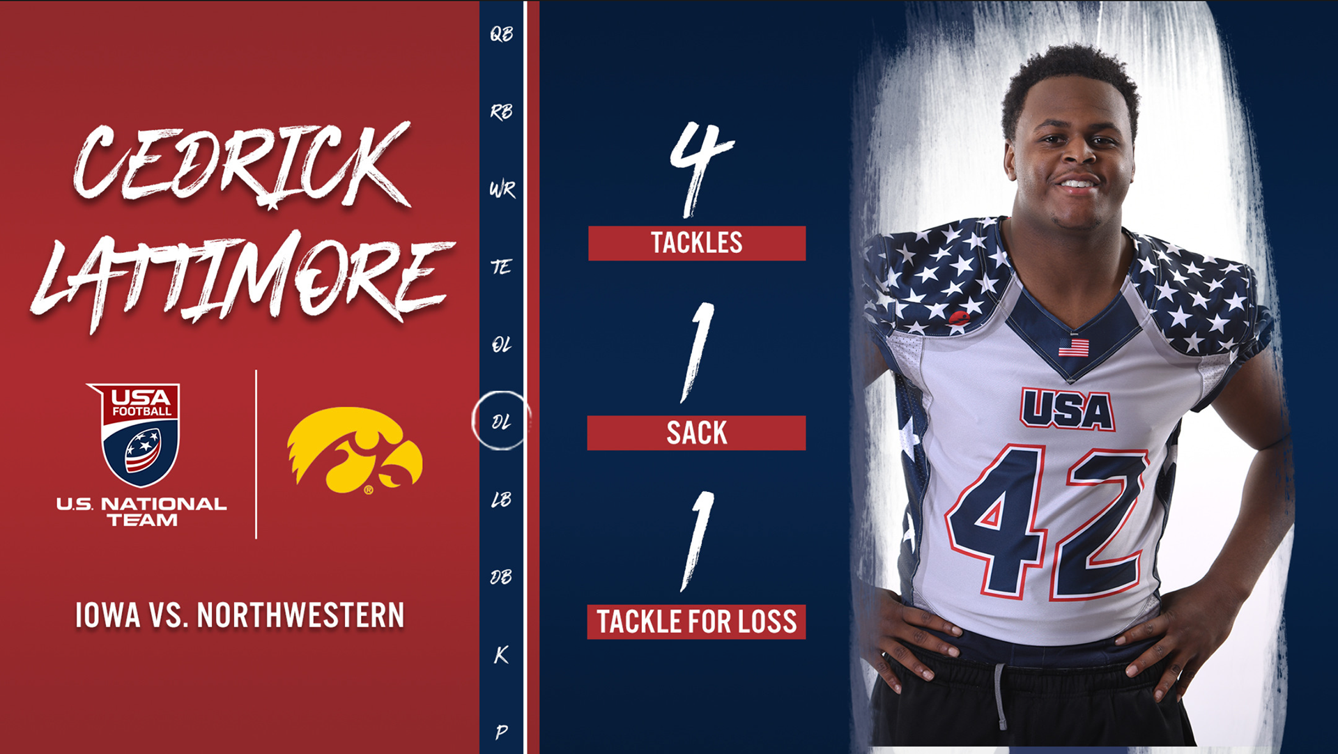
For US National Football Team. This was a template I helped create using elements from previous year's designs. I would update the template weekly with USNFT alums who had high performing weeks in their college careers.
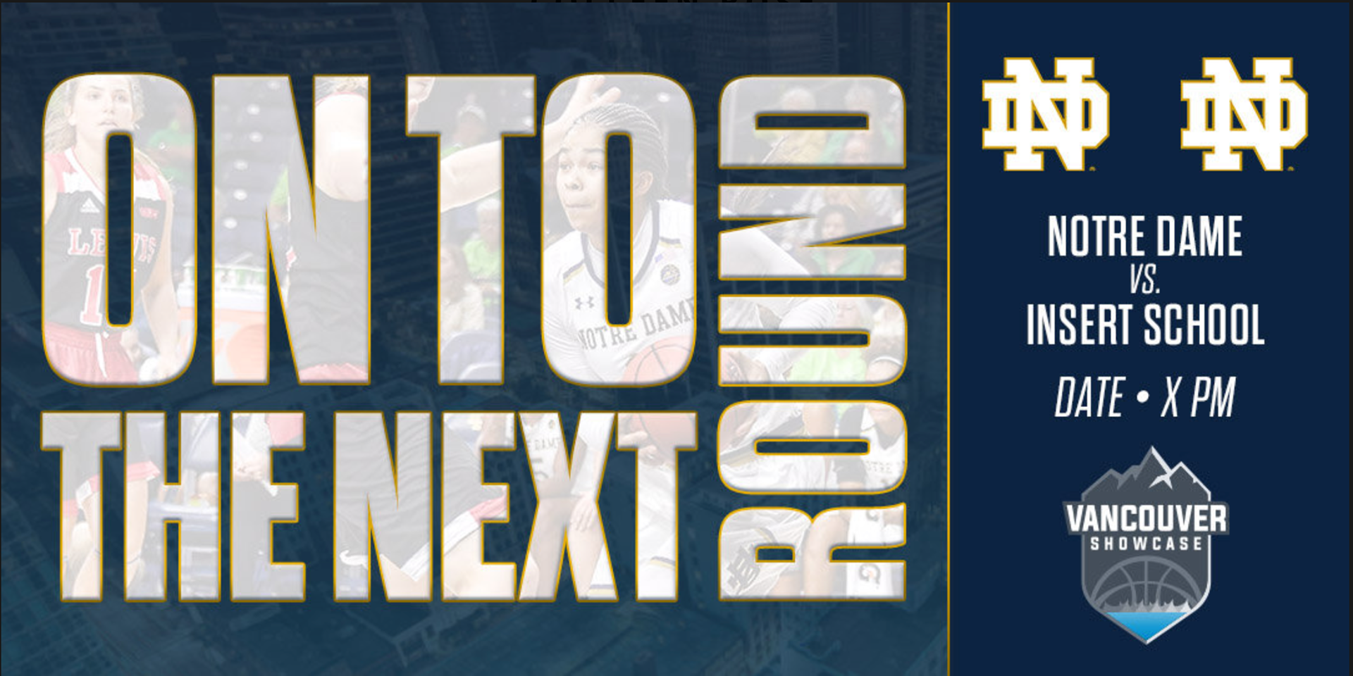
For Notre Dame Athletics: This was a set of graphics I made for the ND Women's Basketball Team to use at their tournament over Thanksgiving Break in Vancouver, Canada. The templates were created for each round and to be adaptable to score, opponent, and date. They were also created to be updated by a Sports Information Director with minimal knowledge of Photoshop.
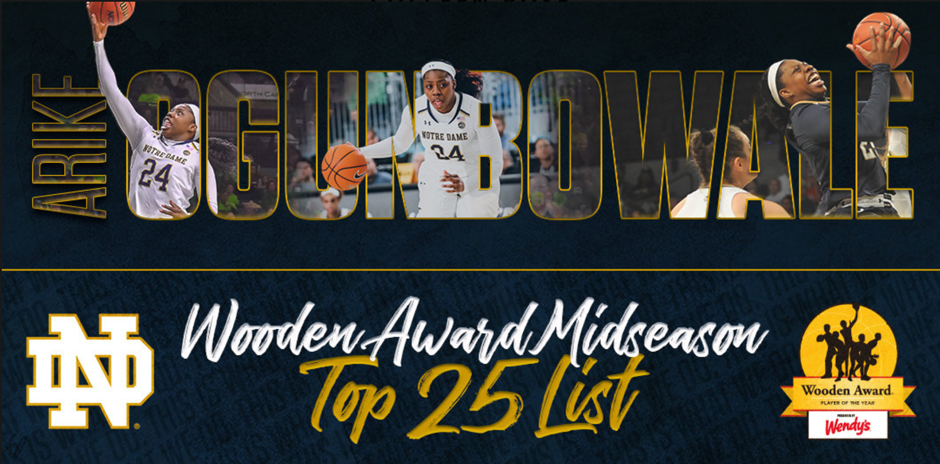
For ND Women's Basketball: I was lucky to work for ND WBB during one of their best seasons and with an amazing group of upperclassmen, who were up for a lot of awards. This was a template that I created and used for players who made it on watchlists. I designed the template and included aspects of the season branding developed by the ND Athletics Creative Director to keep the look cohesive across all WBB content.
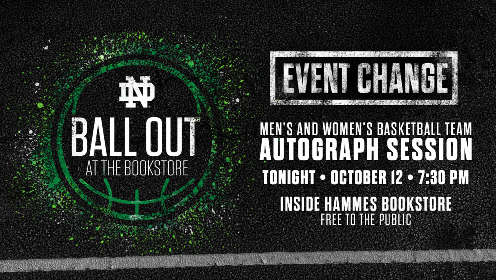
For ND Athletics: This was an event that I helped plan, including a redesign of the graphics. This was a pre-season event for both the men's and women's basketball teams to meet with fans. I did a redesign of the logo to be a more graffiti, street basketball look, and then designed templates in a variety of sizes.
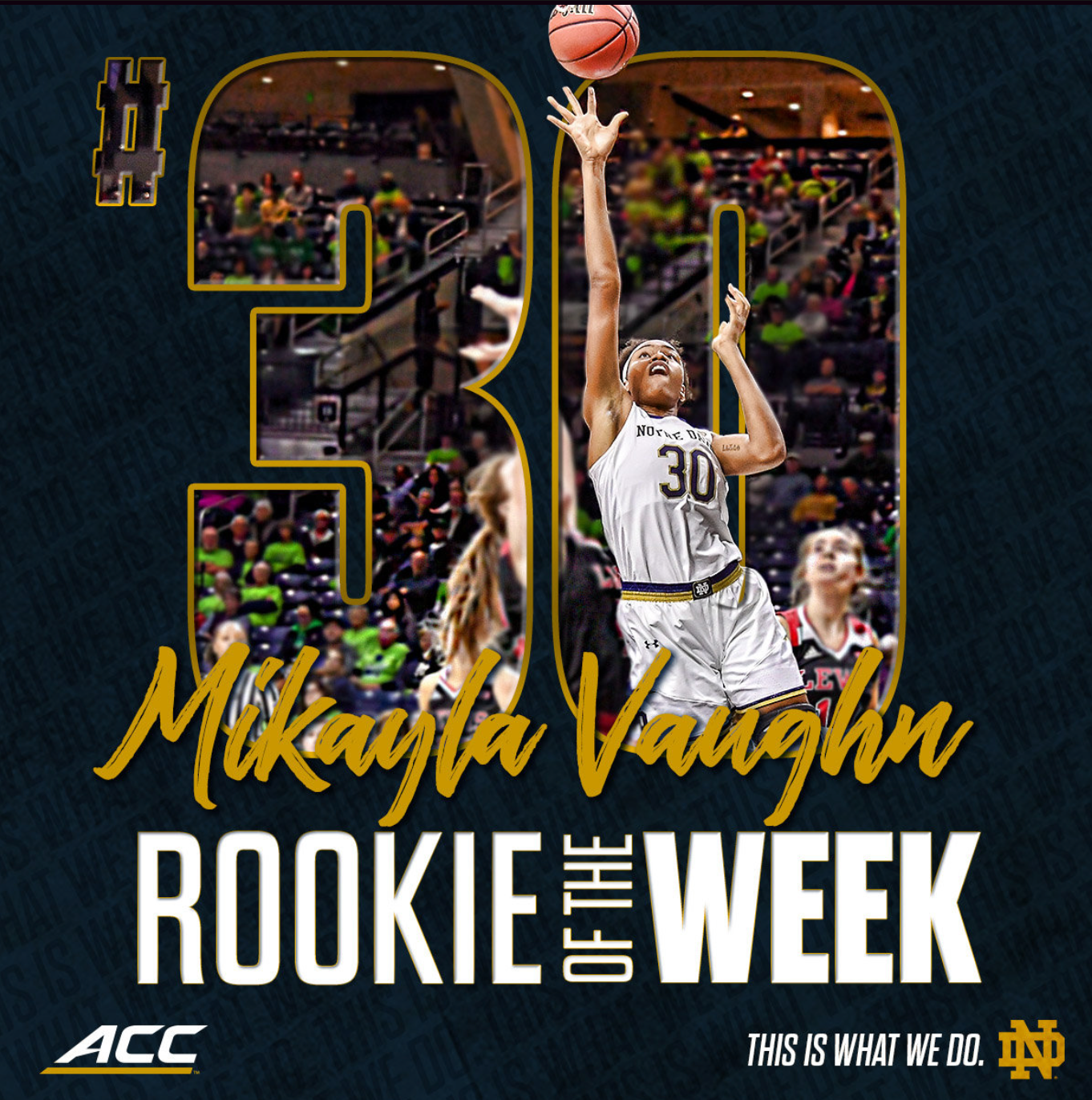
For ND Women's Basketball: This is another example of a template made for ND WBB to recognize individual players on their performance. It has a different look than the player list/national awards but still included similar elements to keep the look cohesive.
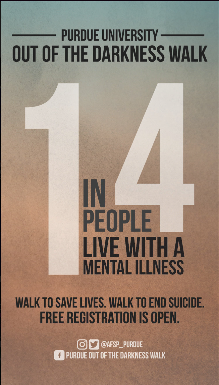
For Purdue Out of the Darkness Walk: This was one of many infographics made to be shared as part of marketing the event on weekly "Why Walk Wednesday" posts.
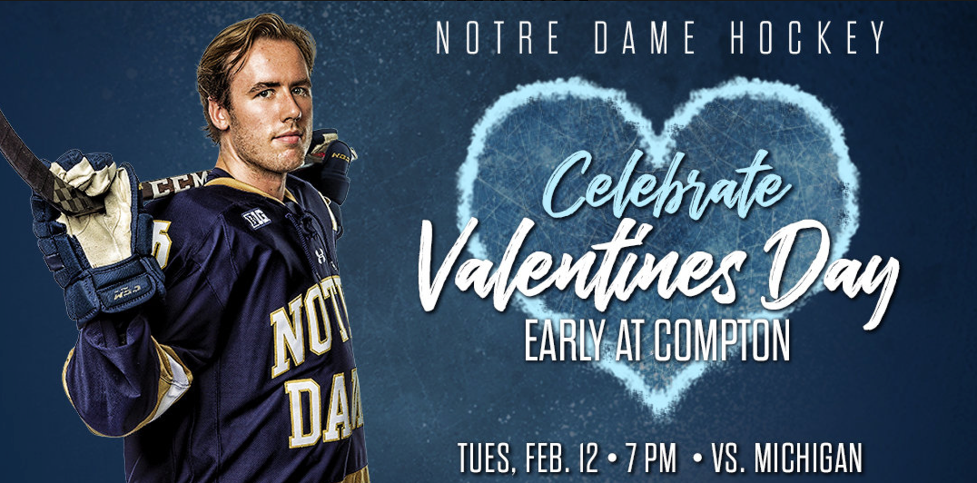
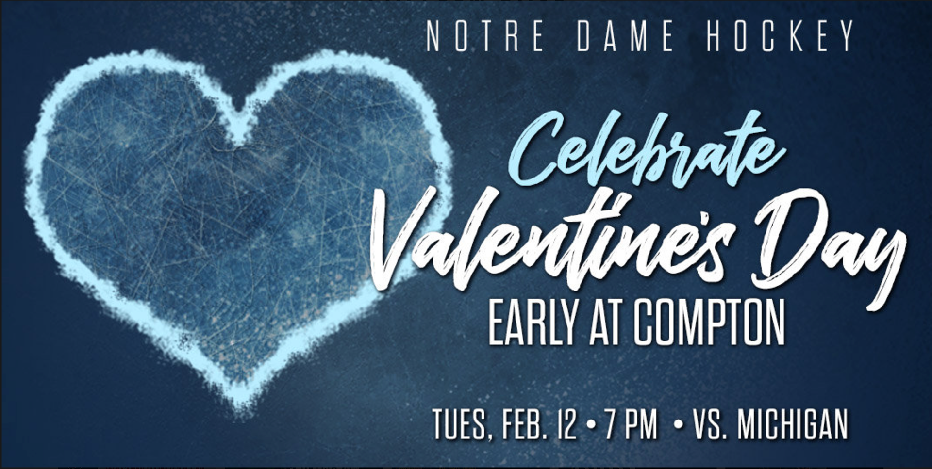
For Notre Dame Athletics: This was created in Photoshop using ND Hockey's season branding for a special Valentine's Day game promotion. This design was created in various sizes, and brought in elements of the ice and of Valentine's to keep it hockey-related, but really market the event.

For ND Women's Basketball: NDWBB has an annual Pink Zone game with a lot of correlating events that helps raise awareness and funds for breast cancer charities. During the season, I did a redesign of the Pink Zone logo, and additionally created a lot of marketing with the new branding, like this email graphic here, and additional t-shirts, social media content, in-game graphics, and an entire brand guideline for the new branding.
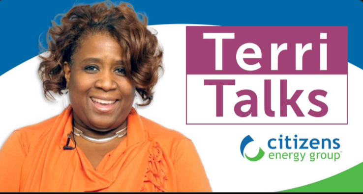
For Citizens Energy Group: This was a graphic created using Photoshop to promote a new video web series for customers. I did the cutout of Terri in addition to designing the graphic.
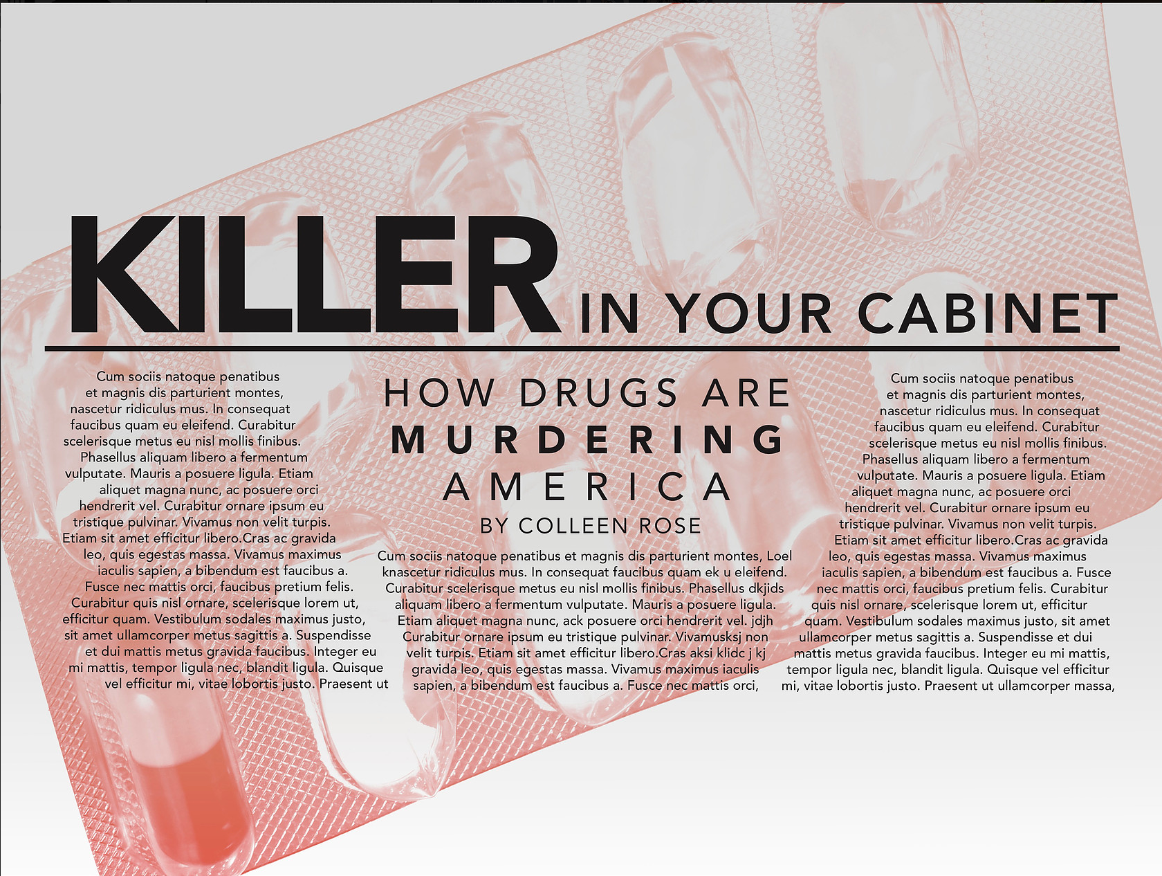
For Undergrad Class: This was a part of a typography and layout project in college. I was provided with a random stock image and had to create various text layouts with limited color choices to convey the message and story. It was a project that really ignited a passion I have for well-designed, interesting, but legible text layout and text hierarchy.

For Citizens Energy Group: This was a part of a large series of social media and web graphics to promote an HR initiative to hire more employees.
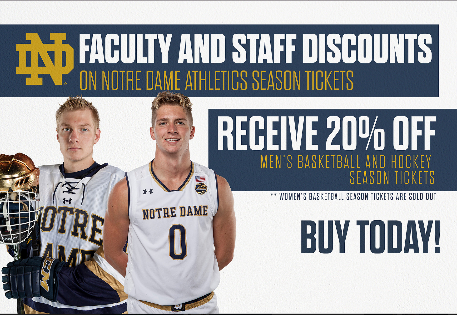
For ND Athletics: This is another example of an advertisement I made to promote season tickets, and to show how I was able to work within strict brand standards, but still make unique designs. One thing I loved about Notre Dame's brand fonts was the ability to make really interesting text hierarchy with the variety of weights and colors that you could use.
For Citizens Energy Group: This was used to bring the Citizens social media to current brand standards, using the headline of our brand campaign, We're All Citizens, and also was an update to make sure social media assets were to recommended sizing. Before this was created the header for social media did not match brand standards and was a different size then recommended causing issues with cropping and blurriness.

For Undergrad Class: This was a part of a typography and layout project in college. I was provided with a random stock image and had to create various text layouts with limited color choices to convey the message and story. It was a project that really ignited a passion I have for well-designed, interesting, but legible text layout and text hierarchy.
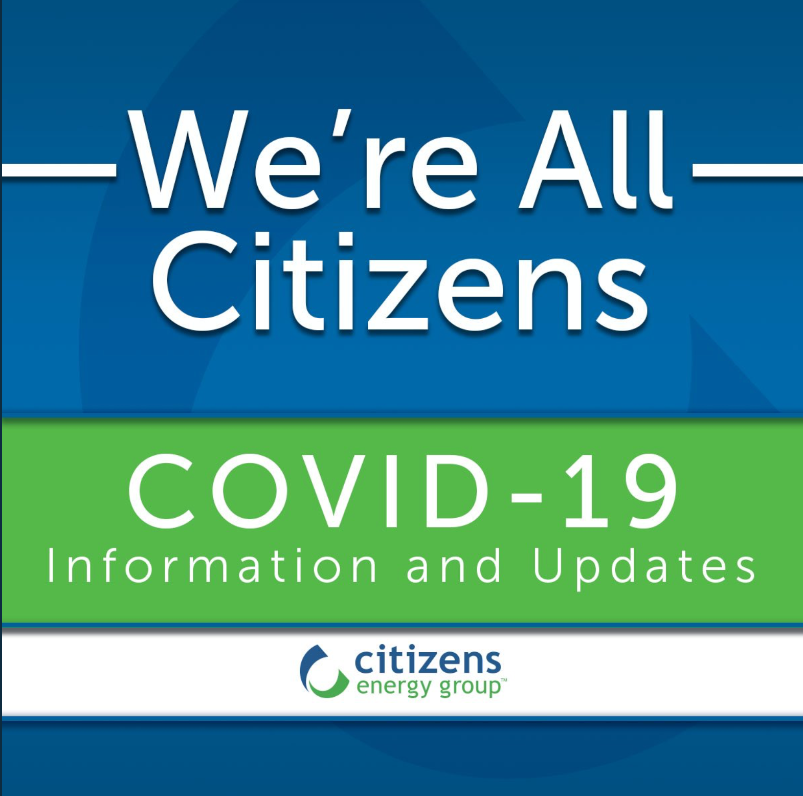
For Citizens Energy Group: This was one of a few different social media graphics created at the beginning of the COVID-19 pandemic during the shutdown to give customers information about their utilities.
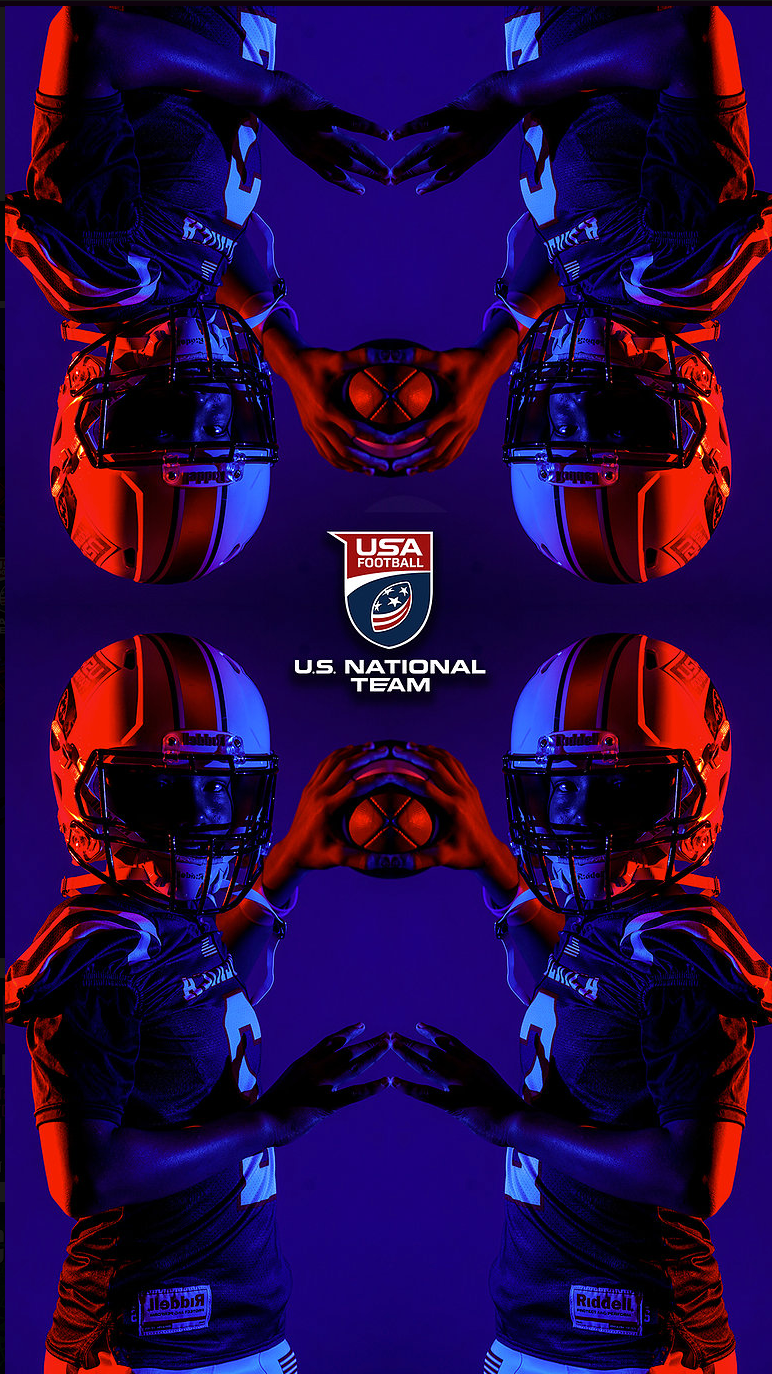
For US National Football Team: This was a phone background I designed for our weekly #WallpaperWednesday campaign. I used photos taken at the last event media day, and created a kaleidoscope effect.
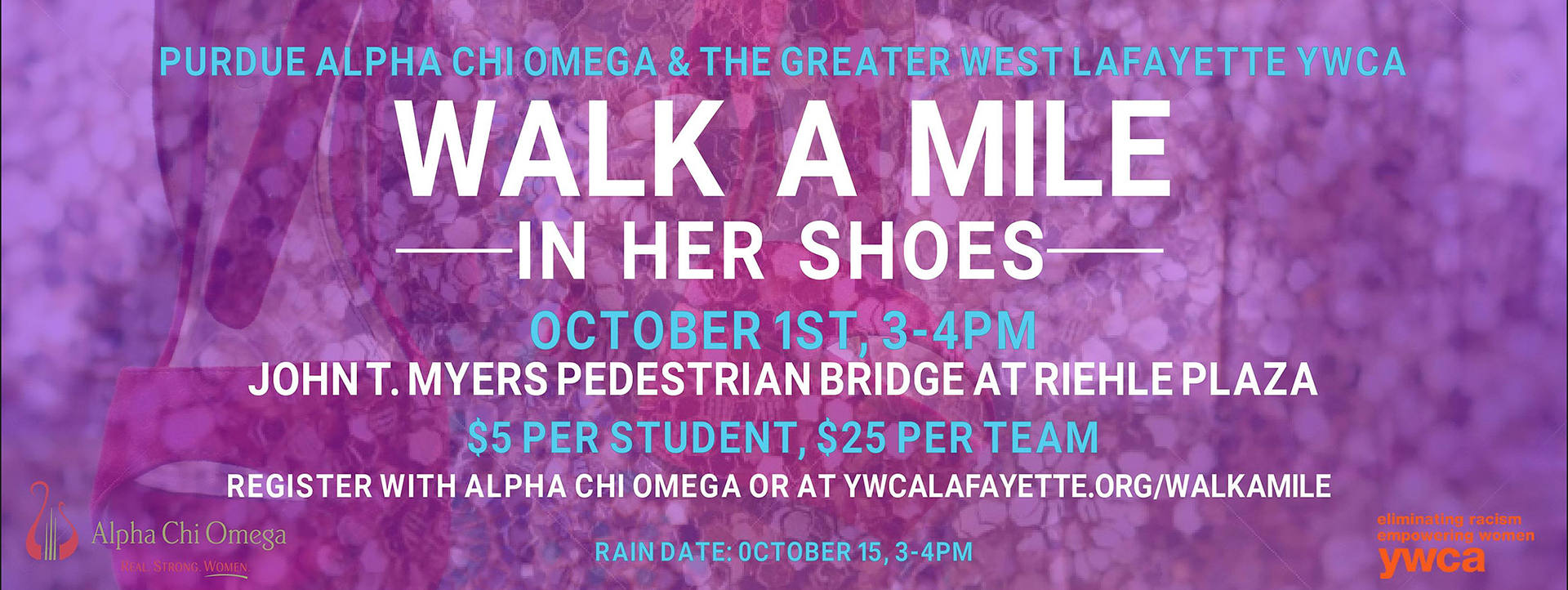
For Alpha Chi Omega, Purdue: This was an event header I created for my sorority in college to promote a philanthropy event.
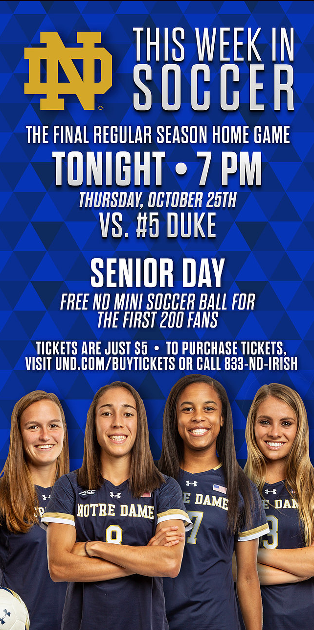
For ND Athletics: This was a template used and updated weekly with player cutouts that I did to promote the ND Soccer games for the week. It was used online and as a print add in a South Bend newspaper. While this example is just the ND WSOC team, the men's soccer team was also included when they had games.
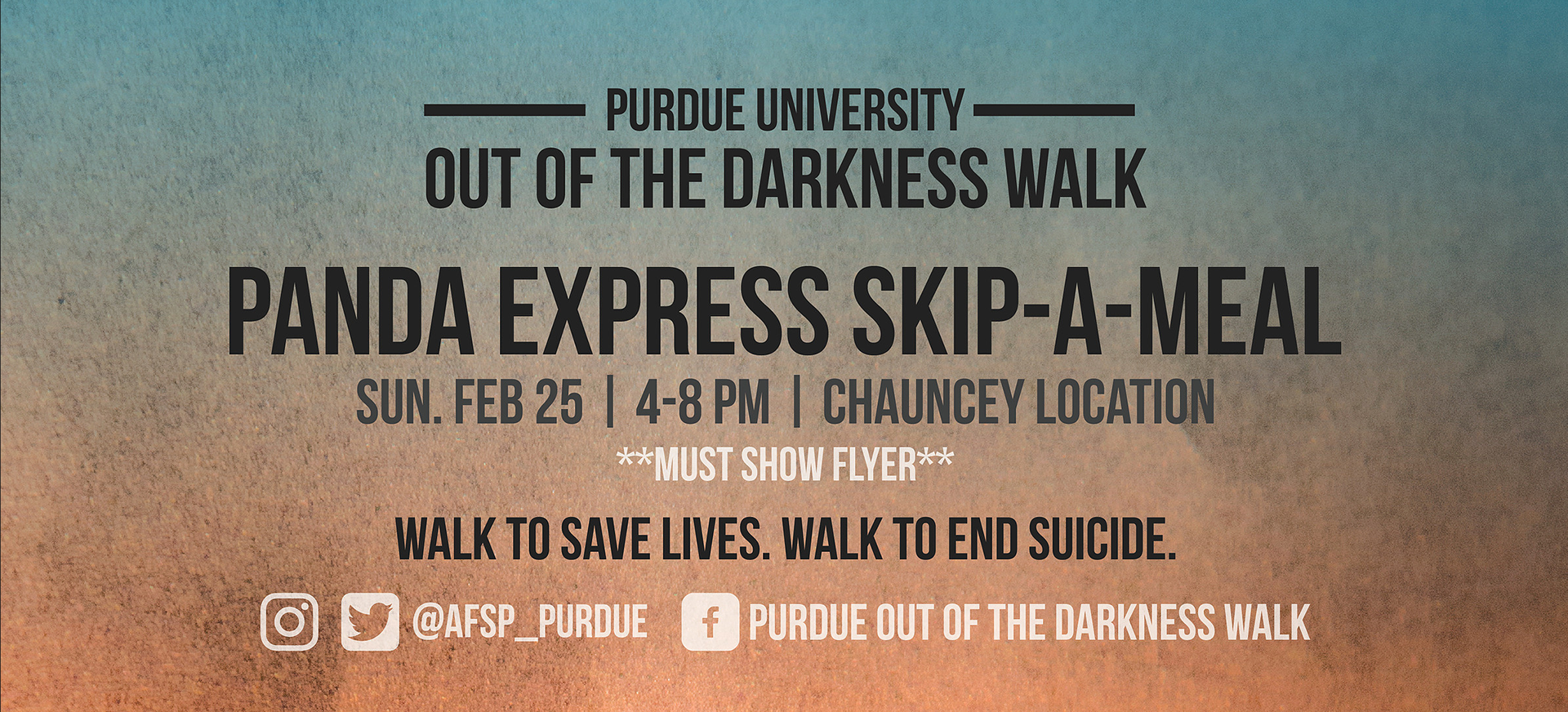
For Purdue Out of the Darkness Walk: This was a part of the marketing for the Out of the Darkness Walk. It was designed to promote a Skip-A-Meal fundraiser, and designed to match the branding of the event for that year.
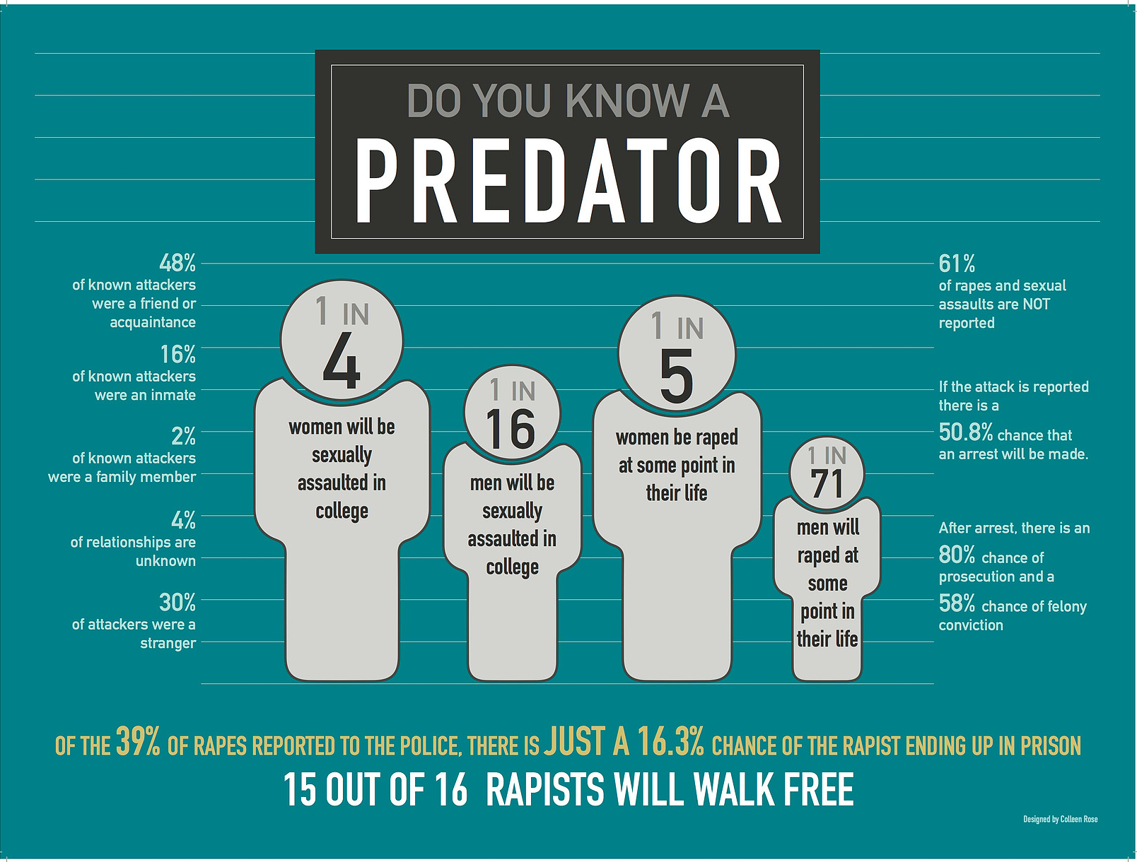
For Undergrad Class: This was an infographic poster I designed in college for an undergrad class. I put a lot of thought into color choice, for example, this color teal is the color of sexual assault survivors. I wanted to show as a many statistics as possible to show the reality and lapses in the criminal justice system when it comes to convicting sexual assailants, by using effective typography.
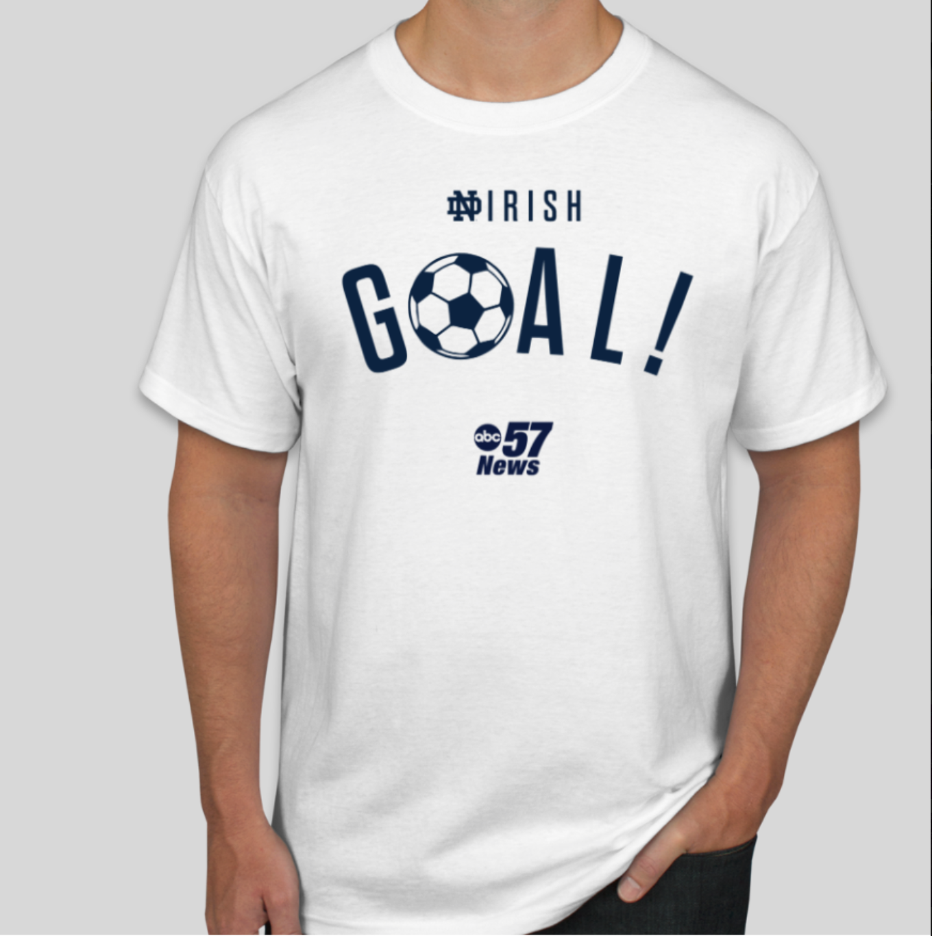
For ND Athletics: This was a shirt to be used by the men's and women's soccer teams.
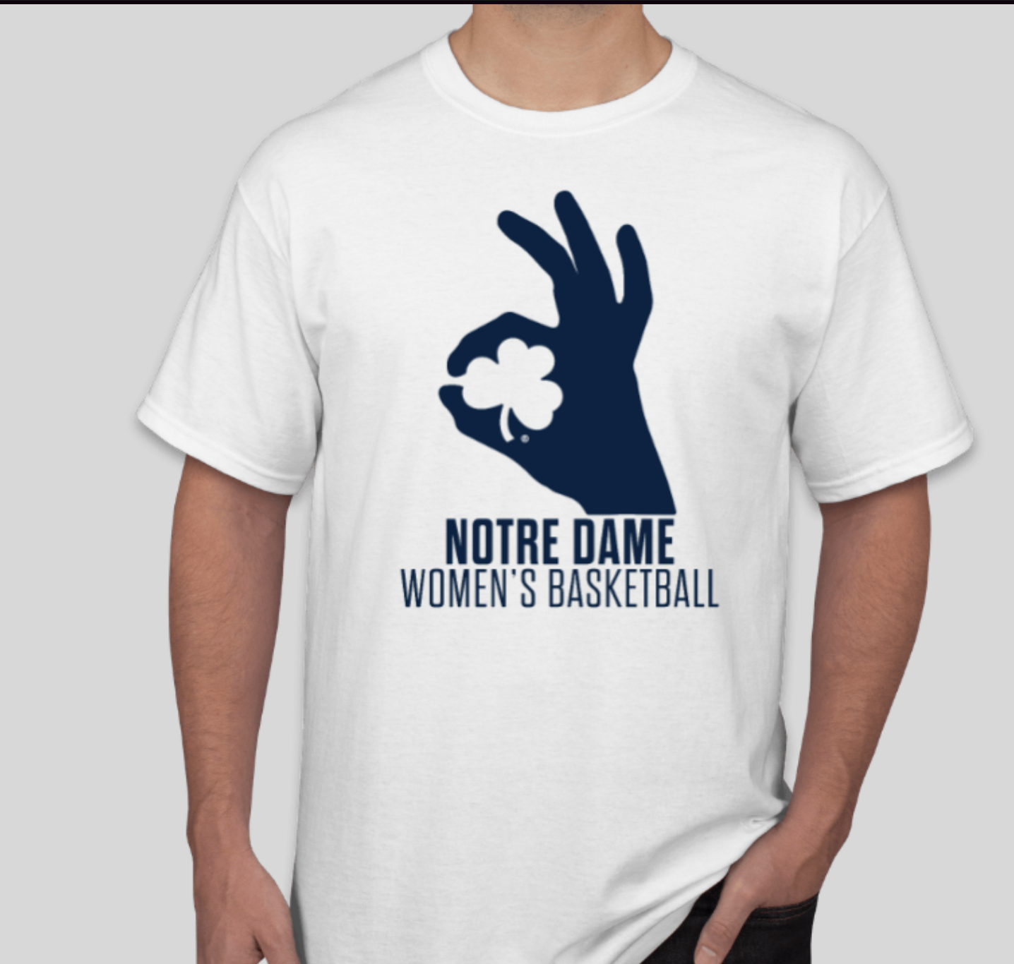
For ND Women's Basketball: This was a shirt I created for a women's basketball promotion, using the common hand sign for a three pointer, but adding the ND Shamrock logo to brand it specific to the Irish. I created this using Illustrator. One thing I factored in was that this was a promotional shirt, so how could we make the best design, but spend the least amount of money. That is why there was an importance to using positive and negative space effectively to still have a dynamic design, but only one print color.
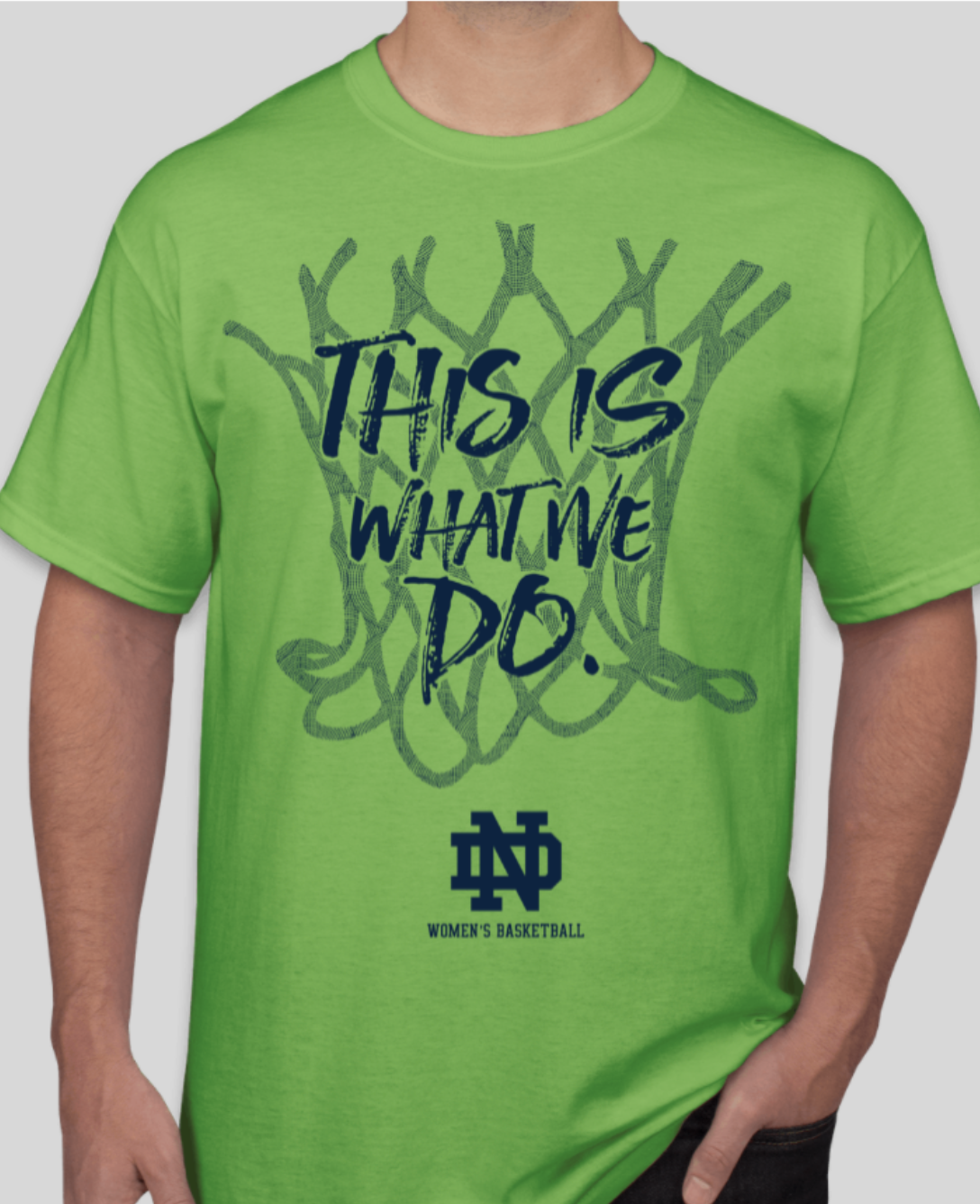
For ND Women's Basketball: This was a shirt for ND WBB Season Ticket Holders and for purchase by fans in other sleeve options. "This is What We Do" was the season theme, and I designed this in Illustrator using trace imaging and masks to create the dot design in the net to create a new design. I was able to use negative space to make a one color design have a variety of textures and still have the text be legible on top of a busy design.

For Notre Dame Athletics: This was a promotional headband giveaway for Notre Dame Women's Soccer. It is a athletic material and double sided.
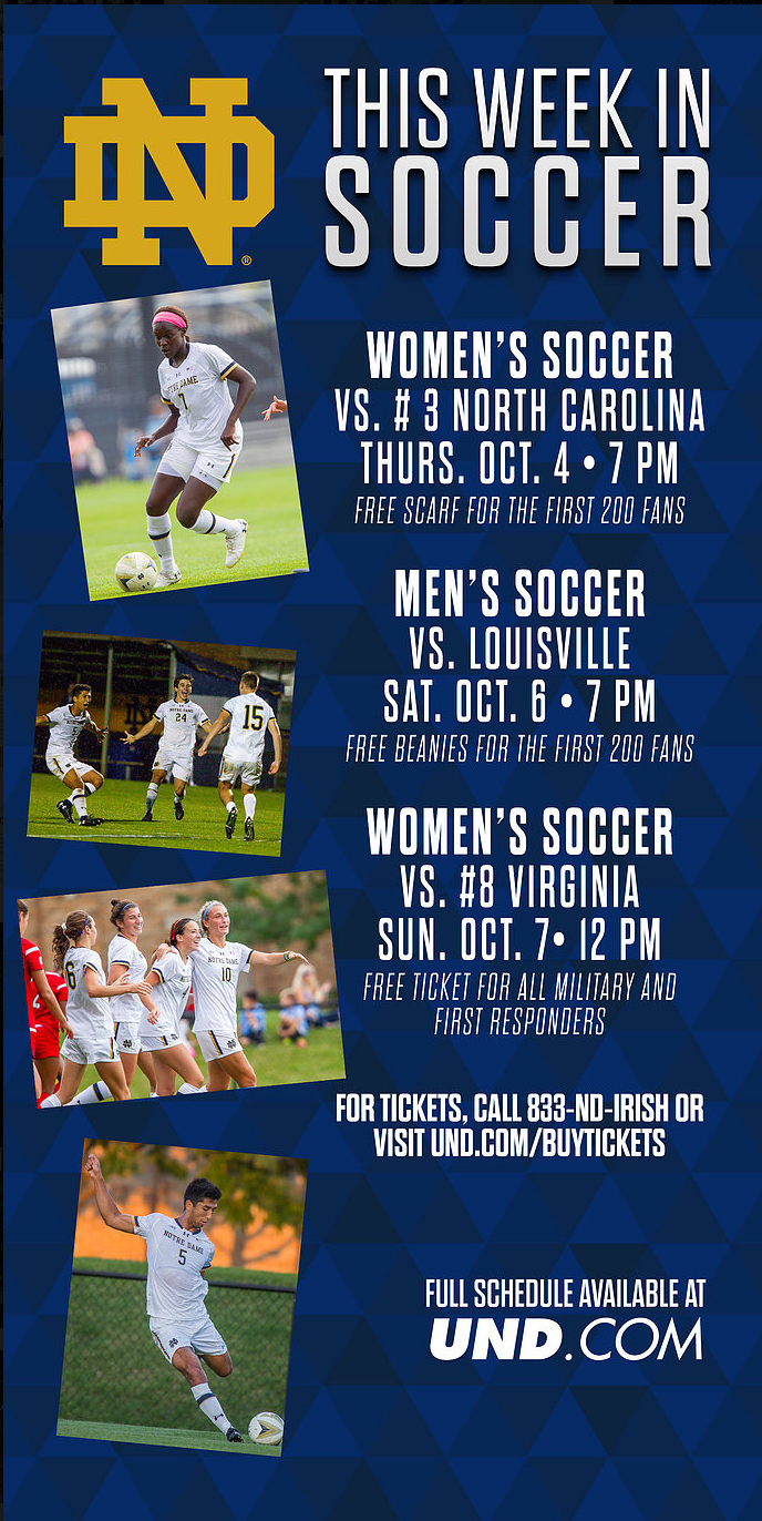
For ND Athletics: This was another example of an ad for ND Soccer to be used in emails, print, and on social media. This promoted both men's and women's teams, and was a template I created and updated weekly.
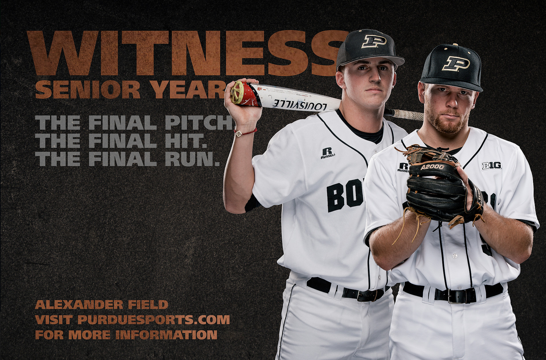
For personal design practice: When I was an intern at Purdue, I wanted to keep building on my graphics skills, so this was practice in doing player cutouts with media day photos, and practicing using text hierarchy, textures, and colors to create a mood and dynamic design.
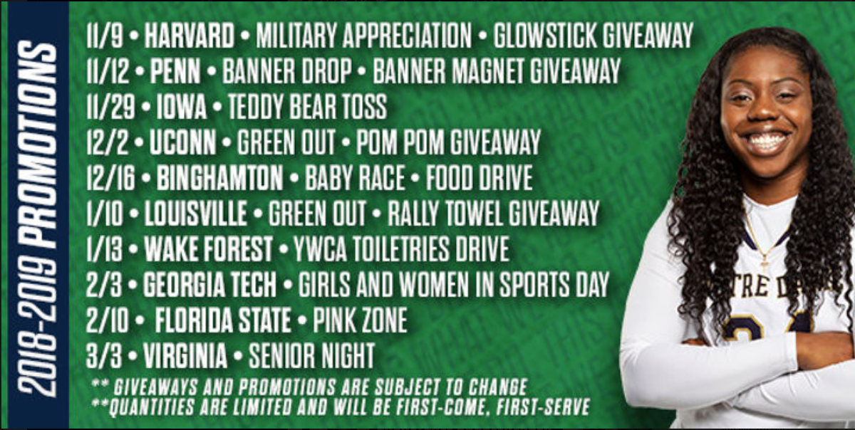
For ND Women's Basketball: This includes a cutout I did on an ND WBB player, and how I laid out a lot of information in a small graphic for social media to show our 2018-2019 season promotions. Additionally, it shows how the branding for the season stayed consistent, but also was uniquely used.
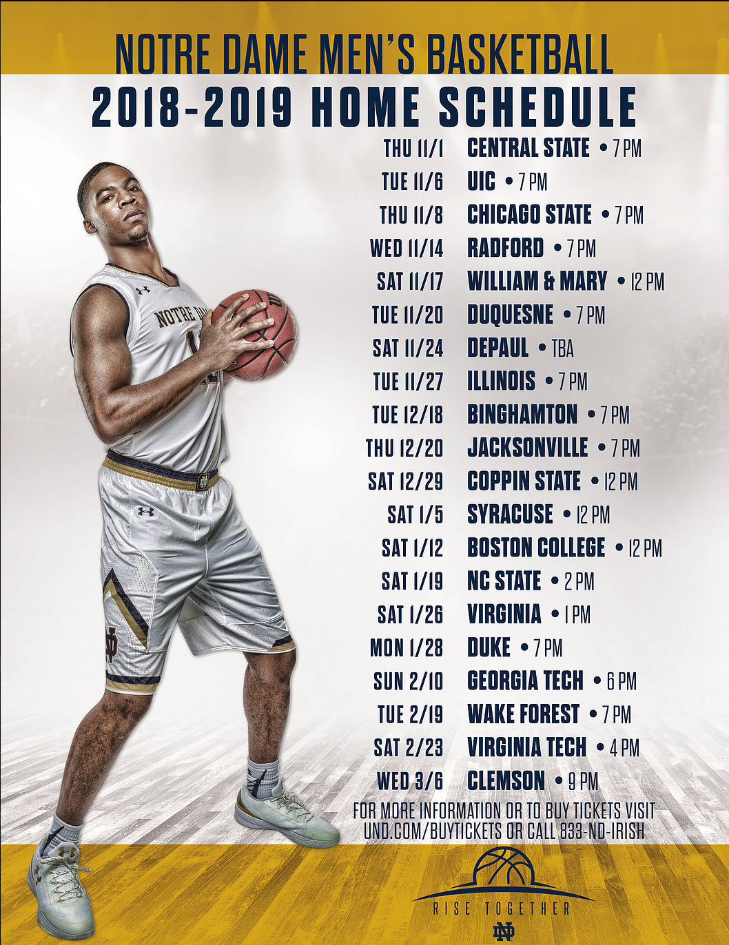
For ND Men's Basketball: This was the schedule magnet created for the ND MBB team.

For Undergrad Class: This is another example of how I worked with text layout to make a magazine layout for an undergrad class.

For Citizens Energy Group: This was a part of a large series of social media and web graphics to promote an HR initiative to hire more employees.

For Notre Dame Athletics: This was a set of graphics I made for the ND Women's Basketball Team to use at their tournament over Thanksgiving Break in Vancouver, Canada. The templates were created for each round and to be adaptable to score, opponent, and date. They were also created to be updated by a Sports Information Director with minimal knowledge of Photoshop.

For ND Athletics: This was a National Signing Day template created for the ND Swimming and Diving Team to use on their social media and provide to their newly signed recruits. I designed it to be able to be easily updated by a Sports Information Director with limited Photoshop knowledge.
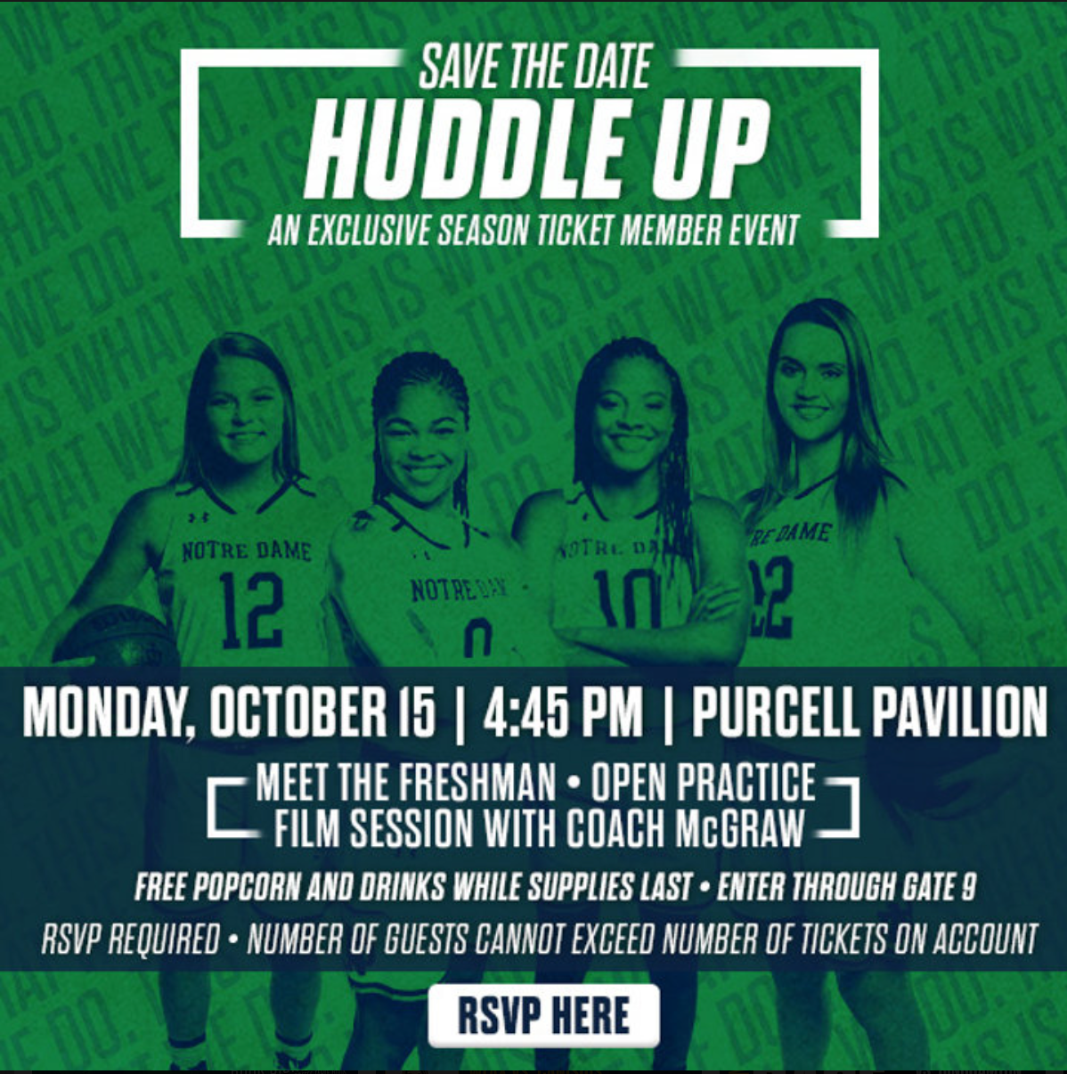
For ND Women's Basketball: This was another graphic using the season's specific branding. I did the player cutouts and did this design in multiple sizes for all social media platforms.

For Purdue Out of the Darkness Walk: This was one of many infographics made to be shared as part of marketing the event on weekly "Why Walk Wednesday" posts.

For USA Football: This was an informational graphic I made to highlight a new partner for USA Football.

For ND Athletics: This was an event that I helped plan, including a redesign of the graphics. This was a pre-season event for both the men's and women's basketball teams to meet with fans. I did a redesign of the logo to be a more graffiti, street basketball look, and then designed templates in a variety of sizes.

For Undergrad Class: This was a part of a typography and layout project in college. I was provided with a random stock image and had to create various text layouts with limited color choices to convey the message and story. It was a project that really ignited a passion I have for well-designed, interesting, but legible text layout and text hierarchy.

For ND Athletics: I was in charge of Notre Dame Auctions, and this was an advertisement I made to promote an auction we had for an email blast.
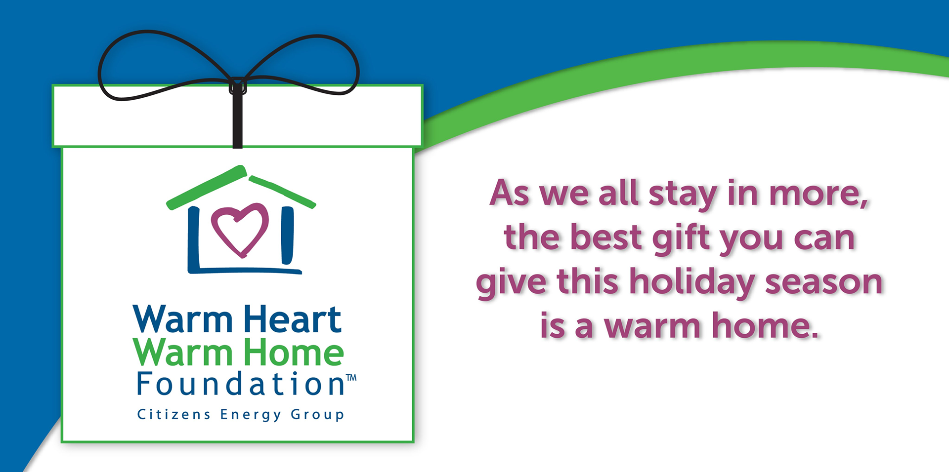
For Citizens Energy Group: This is an ad used for Giving Tuesday to promote the Citizens non-for-profit, Warm Heart Warm Home, which assists customers who can't play their utility bills or need financial assistance for utility repairs.
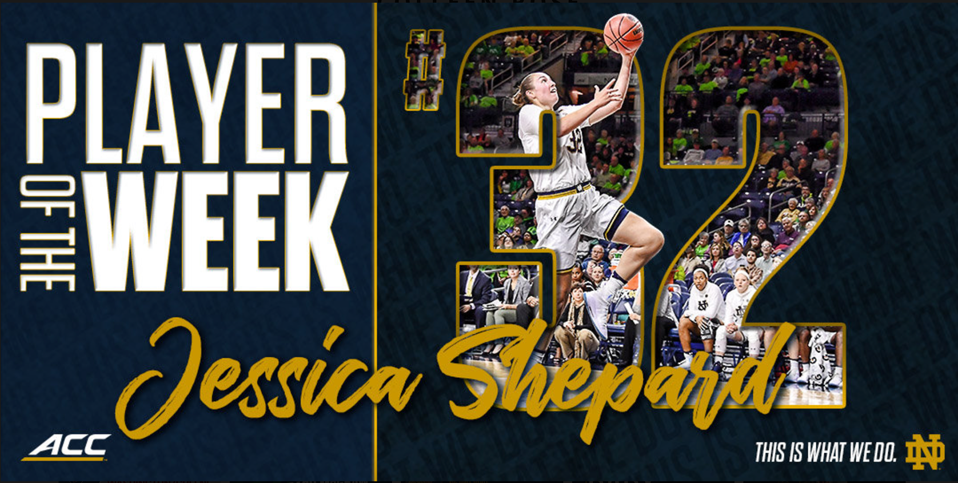
For ND Women's Basketball: This is another example of a template made for ND WBB to recognize individual players on their performance. It has a different look than the player list/national awards but still included similar elements to keep the look cohesive.
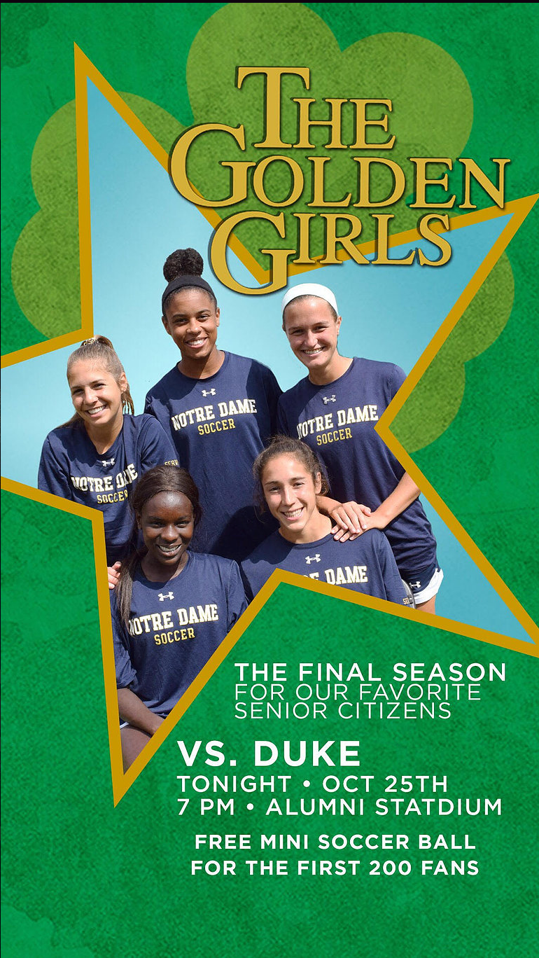
For Notre Dame Athletics. This was part of a series of themed social media promo graphics for players to use on their own social media to market the games and invite friends based off of popular TV shows that matched with the theme/game promotion. The Golden Girls was picked for the last game since it was the Senior Game.

For Notre Dame Athletics. This was part of a series of themed social media promo graphics for players to use on their own social media to market the games and invite friends based off of popular TV shows that matched with the theme/game promotion. I did a play of Freak and Geeks with Cleats and Geeks and edited a photo we got of the team to recreate a popular bleacher photo of the cast.
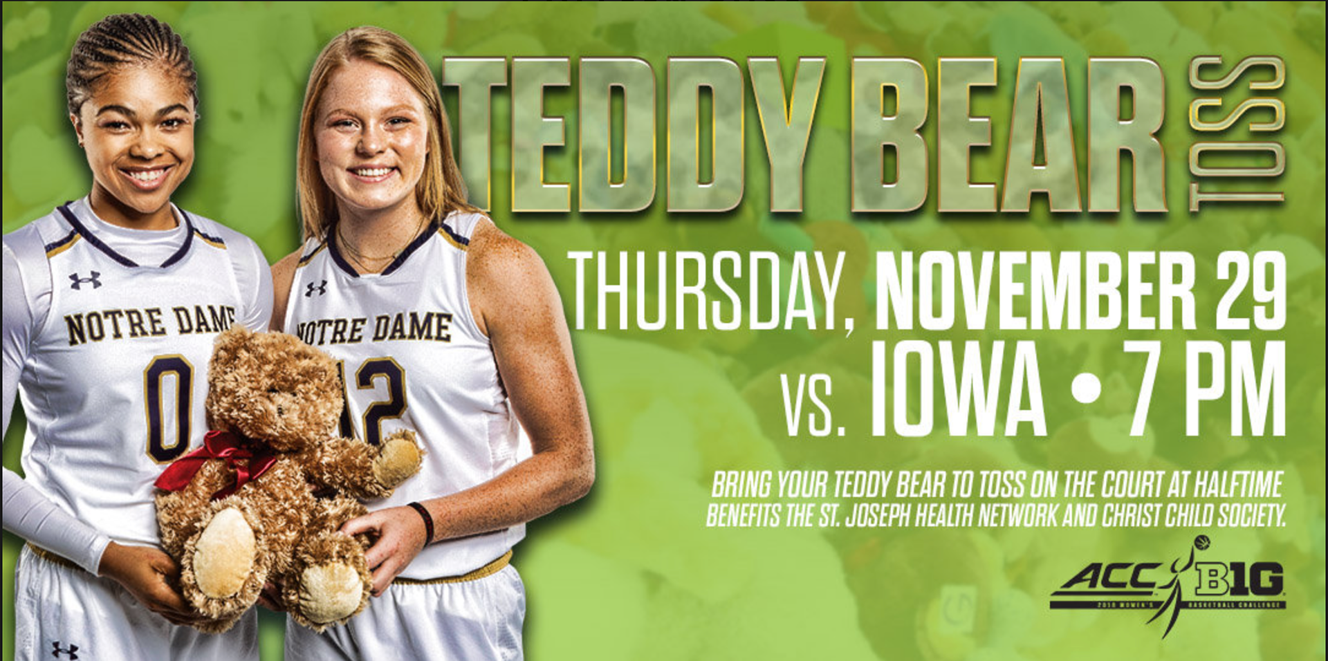
For Notre Dame Women's Basketball: This was a design I based off of elements from a design done by the ND Creative Director. I used his elements to create the graphics for the Teddy Bear Toss game to keep it on brand with what graphics looked like for the season, but give it a pop to make sure people saw it and remembered it since it was one of the largest promotions of the year.

For Notre Dame Women's Basketball: This was a part of the design elements for Senior Day. These graphics were used on social media, in emails, and in-game on the video boards to celebrate the WBB Seniors.I did this design and all the player cutouts.

For US National Football Team: This was a photo I created a phone wallpaper with for #WallpaperWednesday, a weekly social media story that was posted on the USNFT Instagram and Twitter.

For Notre Dame Athletics: This was a sign created for the ND Hockey team to promote their game and promotions for the game.

For Notre Dame Athletics: This was a poster I designed for ND Men's Tennis. I was limited to photos from previous matches that weren't the best quality. I did my best to get clean cutouts and then use design techniques to make it look interesting while also distracting from the poor quality. Overall, the team was really excited with how their poster turned out, especially since as an Olympic sport, they didn't get as much attention or specific designs as other teams who were the "ticket" sports.
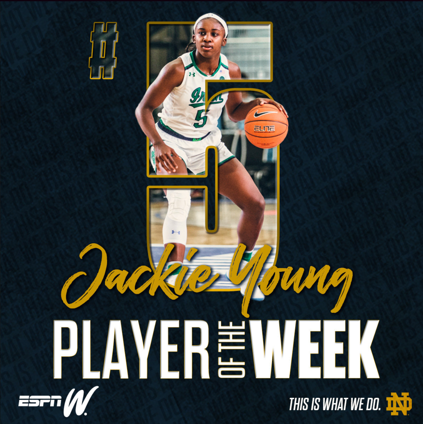
For ND Women's Basketball: This is another example of a template made for ND WBB to recognize individual players on their performance. It has a different look than the player list/national awards but still included similar elements to keep the look cohesive.
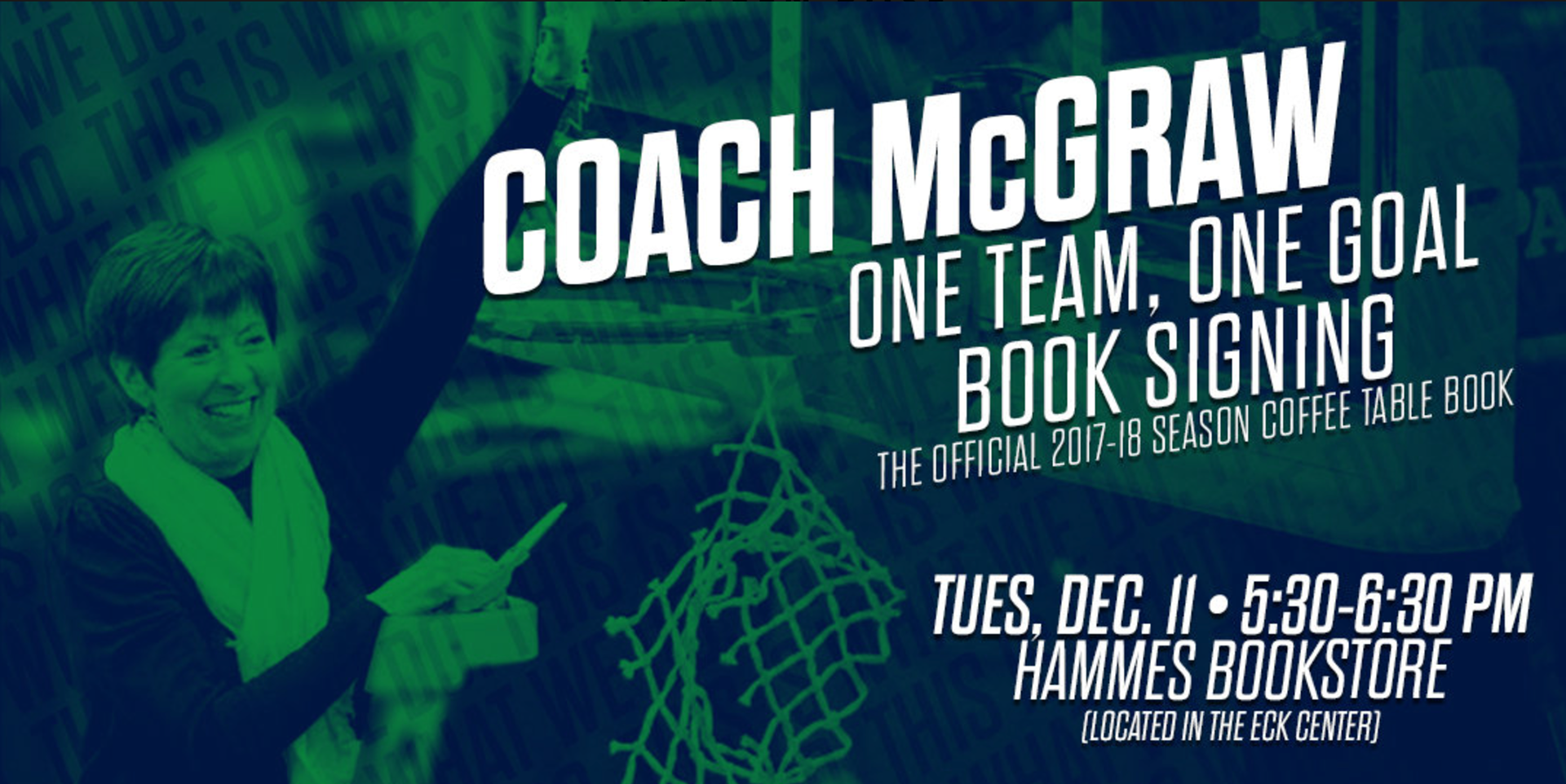
For ND Women's Basketball: This was a graphic template that I reorganized, adjusted, and updated for Coach McGraw's events.

For US National Football Team: This was a series of graphics I made for USNFT alums in the NFL as they started training camp. I created one for every team.
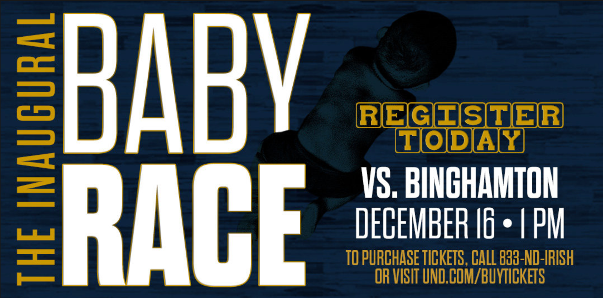
For Notre Dame Women's Basketball: This was a graphic I designed to promote a baby race at an ND WBB game. This design was resized and used in emails, on social media, and on in-game video boards to market the event.

For USA Football: This was a template I created to help us promote our Heads Up Football program. Each week, we'd recognize a different youth football program who hd reached a certain level of coach certification. I created and updated the template weekly.
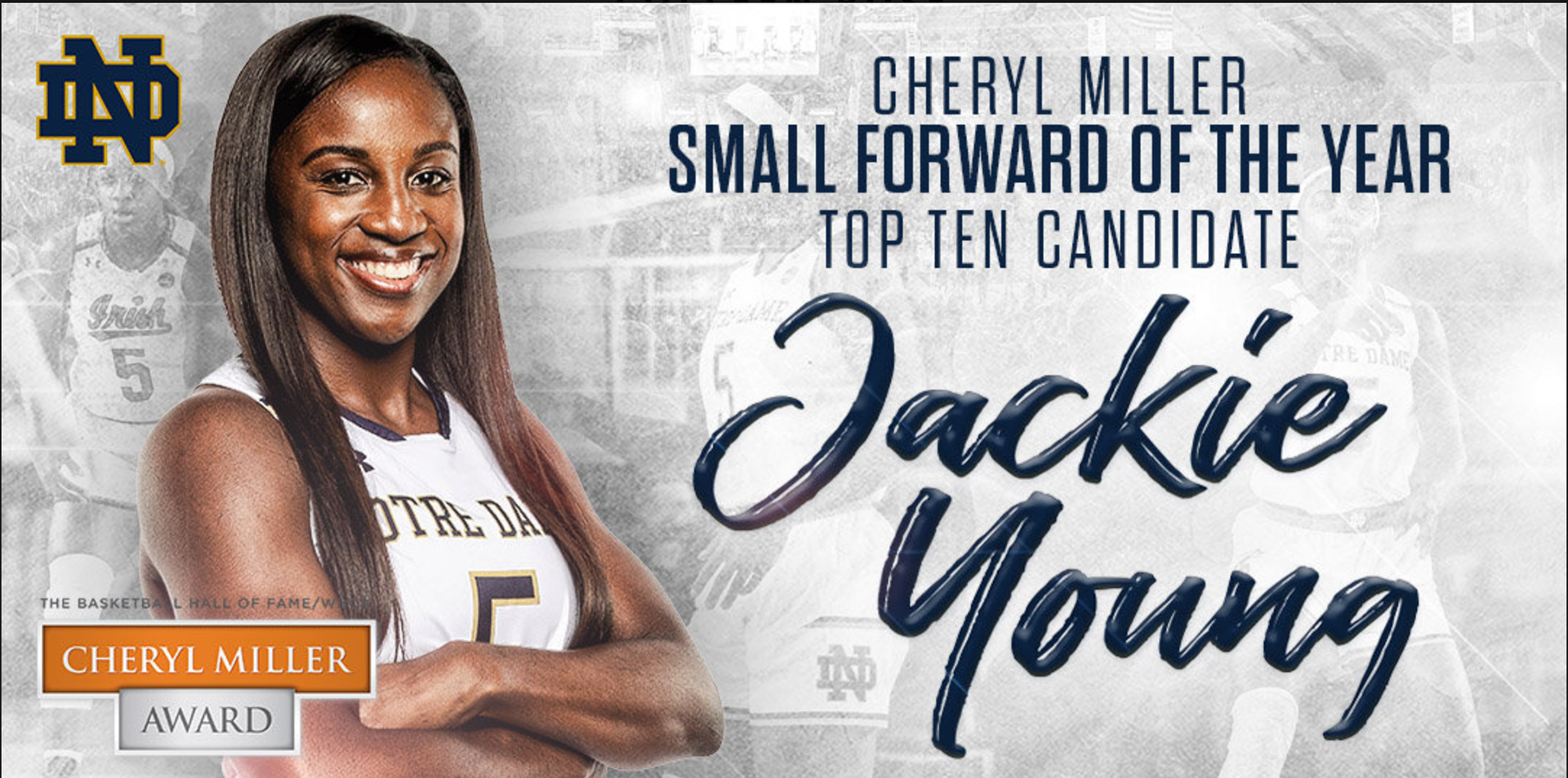
For Notre Dame Women's Basketball: This was an updated version of player specific awards for national honors as they reached smaller and smaller candidate pools.
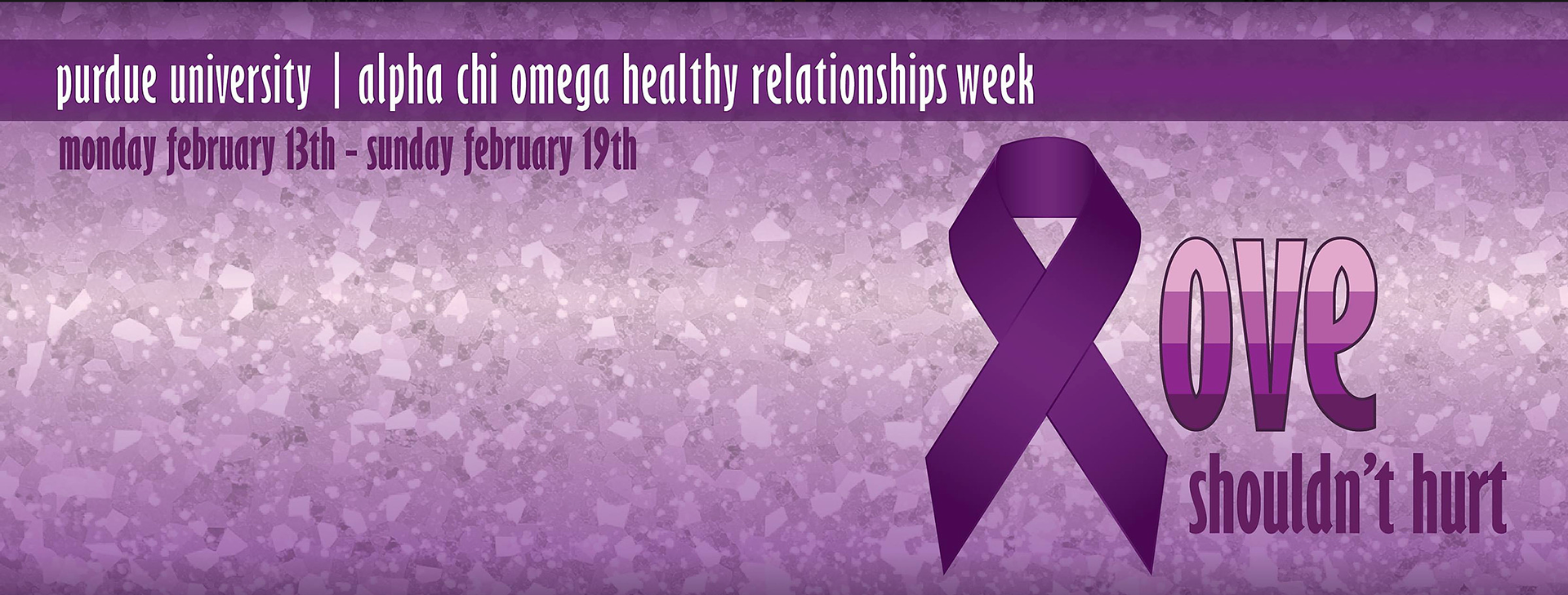
For Alpha Chi Omega, Purdue: This was a Facebook header I made for awareness. The color choice and design elements were to represent domestic violence awareness.
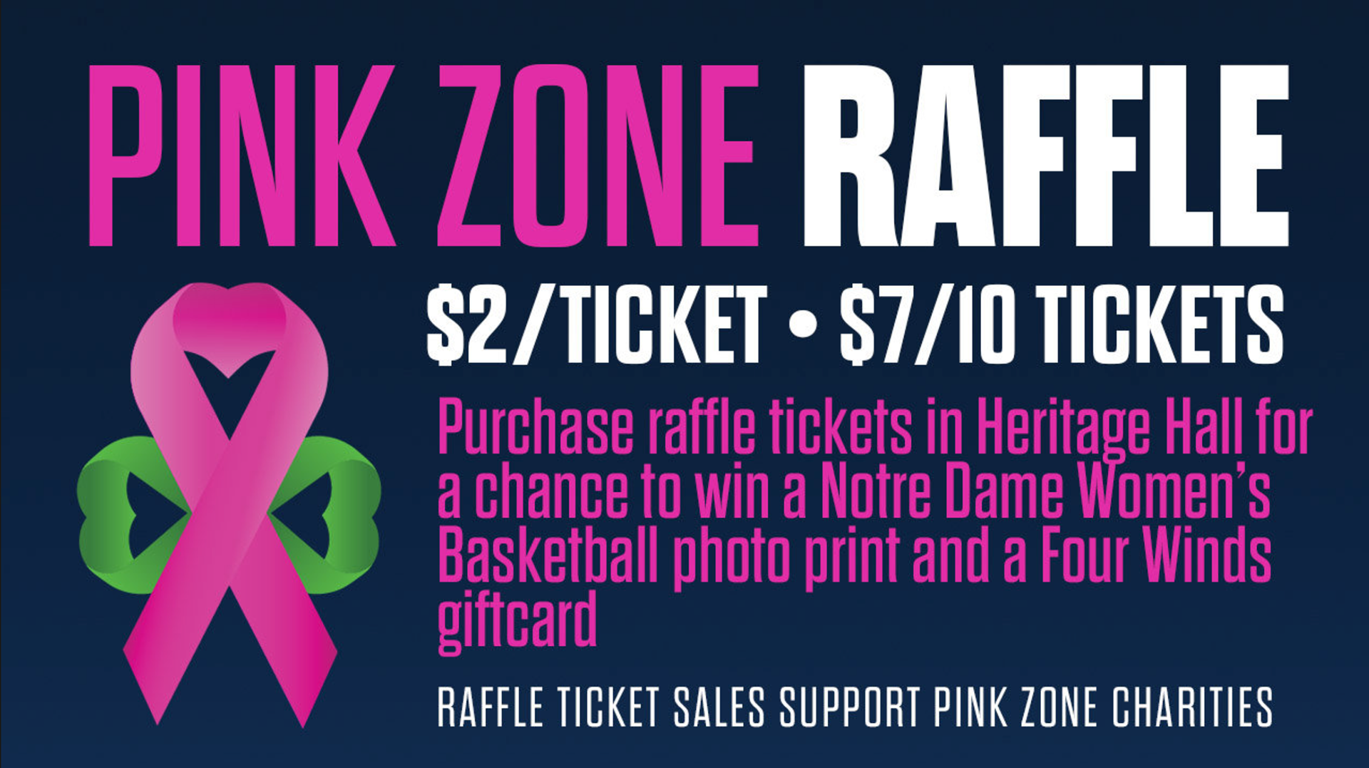
For ND Women's Basketball: This was a part of the Pink Zone branding that I did. I created this for social media and in-game boards promotions.
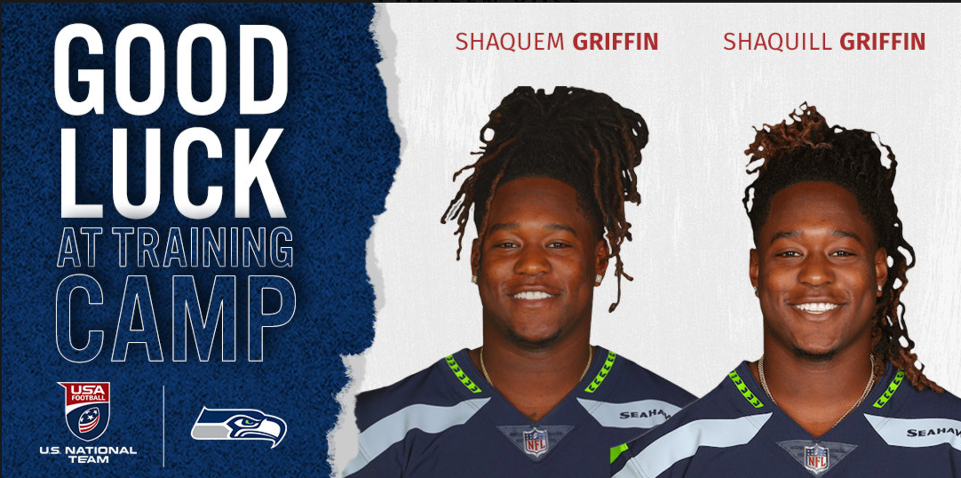
For US National Football Team: This was a series of graphics I made for USNFT alums in the NFL as they started training camp. I created one for every team.

For Notre Dame Athletics: This was a part of an email redesign I proposed for students. It did a quick layout of the sporting events for the week and any associated promotions. I developed the concept and then designed and updated the template weekly.

For ND Women's Basketball: This was a part of the Pink Zone branding that I did. I created this for social media and in-game boards promotions.

For US National Football Team: This was a photo I created a phone wallpaper with for #WallpaperWednesday, a weekly social media story that was posted on the USNFT Instagram and Twitter.
